Showing posts with label user experience. Show all posts

Thursday, August 27, 2015

Do you sell to writers? Maybe consider using good writing.

I heard about a new writing app called Ulysses. (Questionable name, I think. I'd guess the largest percentage of their potential customers would associate this name with pain and boredom; a smaller percentage don't know what it means, and the smallest proportion associate it with utter genius. But that's not my point.)

The point is, I went to the website and was asked a question.


Why, yes. Yes, I do. But this isn't a date; you shouldn't be shutting up about yourself and asking me all about me. In the case of a landing page, it's all about YOU. What the hell are you? From the home page of Ulysses' site, I have no idea what the product is.

More importantly, from a conversion standpoint, what do you want me to do?


Oh, OK, you want me to watch the video. In it, I'm sure, you're going to tell me all about your product.

But wait. You don't. The only words in the whole video are "Do you write?" The video doesn't say anything about what the app does. No benefits, no features, nothing. It doesn't describe the product at all. It shows people using Macs.

The home page also fails in telling me what to do. Users want to know what's going to happen when they click a button; we can help them by providing clear, meaningful CTAs. "Learn more" is everyone's favorite CTA to deprecate, but at least it gives a clear command.


These buttons do not. How about "discover" or "meet" or even "learn about" or "see"—in short, how about a verb here, please?

The app is for writers. From this page, it doesn't appear that Ulysses employs any.

Once I click in, though, it becomes clear that they employ too many—or at least, that their writers employ too many words.


What? Make up your mind. Which is it? What does this even mean? That's a question I asked myself a lot reading through the verbiage on this page.


"Consider yourself a night owl?Ulysses offers a dedicated Dark color mode. It's said to also save energy."

Weak. "Consider yourself" is waffling; this should be "are you." But you haven't made the connection between being a night owl and using Dark color mode, anyway, so your offer of a "dedicated" (what the hell does that even mean here?) Dark color mode is a non sequitur.

And then the last sentence. OK, Yoda: this is your big selling point? "It's said to"? You may as well say "We don't actually believe that it saves energy, and there's no evidence to support this half-assed claim, but we're just putting it out there."

And come on, people. Proofread. You're marketing to writers, who (while we're not all copyeditors) are likely to notice that you forgot a space between the first two sentences.


"When it comes to distraction-free writing, there's still no better way than going full screen. We know. We invented it."

You invented going full screen. Yeah.

It's bad enough that any site should have writing this awful. But a site selling something to writers? Wow.

Monday, November 3, 2014

No Entry: How TV ads are like web sites

In modern web design and content strategy for the web, it’s important to remember that there is no longer any such thing as an entrance to the site, especially if you’re doing your  SEO well. Any page can be an entry to the site and must therefore provide a warm welcome to visitors (and location awareness, and brand identity, and and and).

The same rule applies to television ads. 


Creative agencies should think the same way about modern television advertisements, understanding that the viewer might enter the ad at any point. TV viewers get up to change the laundry, wash the dishes, or check on the kids; we return to the set mid-commercial. Ads lose some or all of their effect if they rely on viewers to watch from the beginning. 

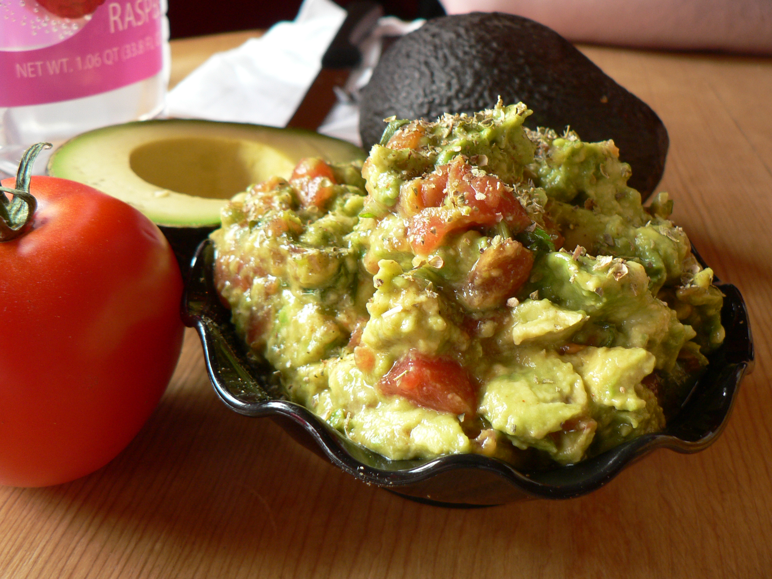
At my house, we watch a lot of football, but even I (one of the rare breed who enjoy watching advertisements) use the commercial break as a chance to chat about that last play, or finish making guacamole, or get another beer. Often, my attention will be attracted to an ad partway through. This creates an opportunity for the ad to have an effect, but that opportunity is lost if the ad doesn’t pay off the partial view. If the ad relies on a setup that I missed, that’s a fail.

This Dodge ad tells the story of the Dodge brothers, John and Horace, but if you’re not paying attention at the beginning, or you’re not listening carefully to the voiceover, you’re not going to get it. And while the remaining material isn’t bad—revving engines and drag-racing imagery are still appealing, especially to a muscle car aficionado like me—letting the viewer lose out on that story is a big miss.


I do enjoy advertisements with a big reveal at the end, but are they really as effective as an ad that delivers its message no matter where the viewer picks up the thread? It depends on the placement, the saturation, and the content. 

Placement: In football games, for example, an ad that runs during a timeout is more likely to get beginning-to-end attention than an ad running at halftime, because viewers know the game will come back on again any second and are more likely to sit still for commercials.

Saturation: If the ad is running several times during a given program, using a build-up will work better. Viewers whose interest has been piqued will likely watch from the beginning the next time the ad airs.

Content: It comes down to this: Is it a great ad that appeals to its audience? (Guests shushed me during the Budweiser horse-and-puppy ad.) Then it will get watched. But considering the audience’s entry point is critical in making an ad effective for television viewers. 


Guacamole photo by stu_spivack (CC-BY-SA-2.0), via Wikimedia Commons.
Family watching TV photo by Paul Townsend from Bristol, UK [CC-BY-SA-2.0), via Wikimedia Commons.

Wednesday, May 14, 2014

That's Not What I Ordered: UX at a Restaurant

User experience (UX) isn't hard to understand. Like a lot of web specialties with fancy names, it's mostly just common sense. People can specialize in it because a) not everyone has common sense and b) not everyone takes the time to think through all the details.*

Also like a lot of web specialties with fancy names, UX is not something that's limited to the web. When you call the gas company to ask about your bill and their recording tells you that you'll be on hold for approximately three minutes, and you're actually on hold for three minutes, that's good UX. But if you're told three minutes and you're on hold for a half hour, or you're not told an approximate hold time at all, that's bad UX.

Looking at something through a different lens allows us to understand that thing better. (This is why poetry is so cool: it nearly always gives us a new perspective.) That's why analogies are so awesome—even if I did get smacked for exclaiming over this one:


My husband and I went out to lunch today and experienced UX through a restaurant lens.

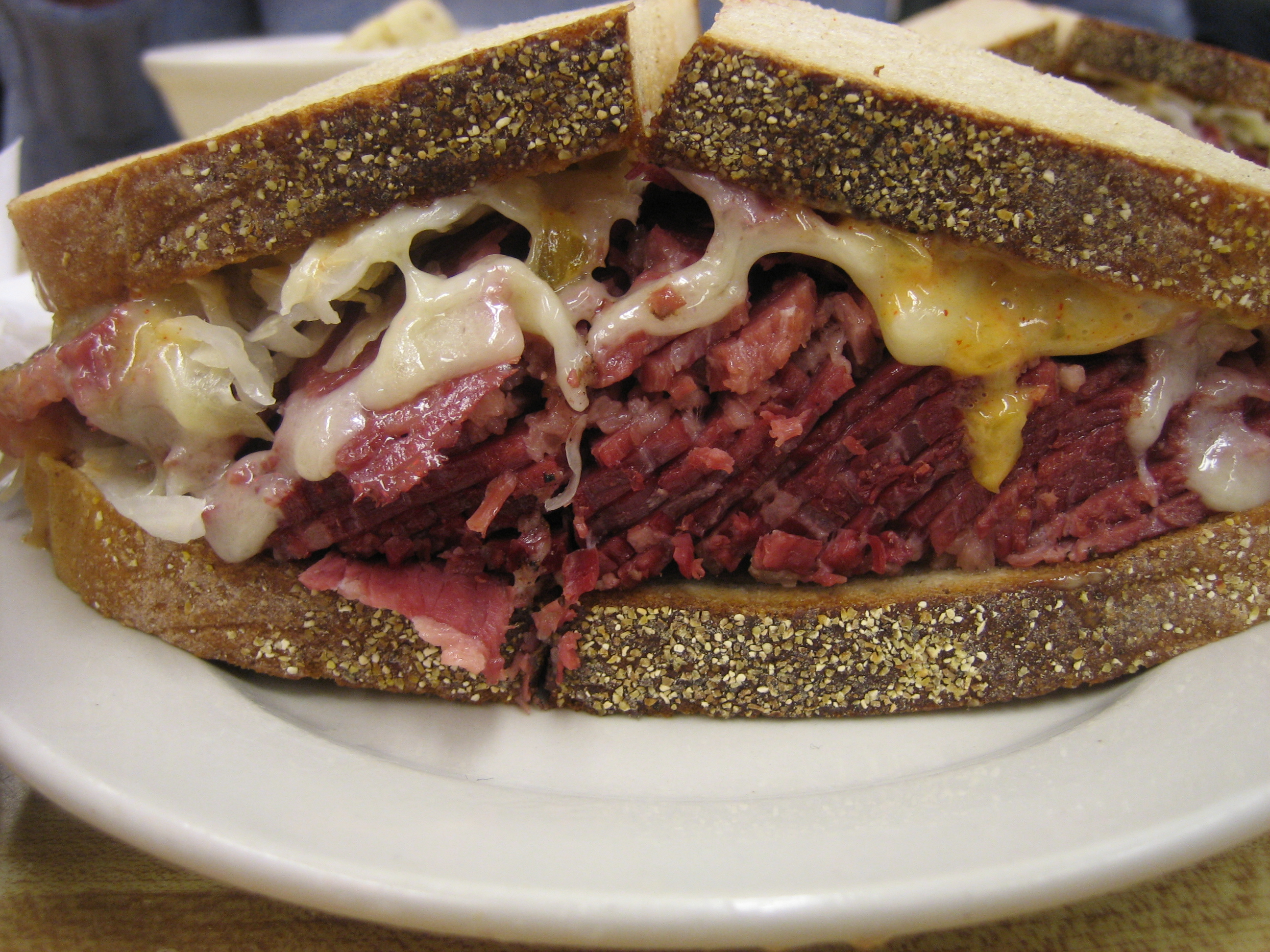
He ordered a Reuben sandwich. You know what a Reuben sandwich is, right? Of course you do. Everybody does. It's this:


And this will tell you that, although there's a bit of variation here and there, the Reuben sandwich is pretty standardized.

Except today. My husband ordered the Reuben and he got this:


It looks like a flower, right?

Now don't get me wrong. It was probably delicious. But an open-faced Reuben with fresh cole slaw and shaved beets on top was not what my poor husband was expecting, and therefore he did not have a good experience.

That's the first truism: People want what they are expecting. If they don't get it, they're not happy. You can give me an all-expenses paid trip to Hawai'i, but if I was expecting an Alaska cruise, I'd be disappointed. No matter how good the Reuben was, it wasn't what my husband expected.** Quality of experience is based in expectation.

"Did you read the description?" I asked. "Did they say it was open-faced?"

He gave me a look. "Of course I didn't read the menu. I didn't read past the word 'Reuben,' anyway."

That's the second truism: People don't read. As content creators, as writers, this might make us sad. (It makes me sad, anyway.) It might make us worry about the future of humanity, decency, and culture. Et cetera. But it's a truth, and as content creators and writers, we must acknowledge it. TL;DR. People don't read.

On the web, user experience design relies on the same truisms. Label a button with the phrase "Show Me My Credit Score"*** and give them an opt-in page after the click—or, hell, give them an adorable kitten after the click—and they'll be disappointed, because experience is based on expectation. Put small print under the button saying something to the effect of "Registration is required to get your free credit score" and they'll still be disappointed, because people don't read.

Are you offering an open-faced "Reuben" sandwich with fresh cole slaw instead of sauerkraut and some locally-sourced, tender beets shaved on top, that will be a pleasure to the eye as well as to the palate? Great. Tell me so. Say "The XYZ Restaurant's 'Reuben'" instead of just "Reuben." Say "Our Take on the Reuben." Say something (briefly, ever so briefly) in the heading that will make me understand that what I'm getting isn't a thick, greasy, cheesy hot mess like the one pictured above.

Fulfill the expectations you set up...without making people read too much. That's good user experience, no matter what your business.


*In fairness, c) it also requires a solid understanding of the research that's been done in the field, but applying this research requires common sense.

**Now, it's a fact of life that expectation breeds disappointment, but we don't seem to be able to keep ourselves from setting up expectations. Personally, I'm trying. Not expecting makes me happier. But that's not really something we can rely on from a UX point of view.

***"Show me" rather than "Get my" courtesy of Joanna Wiebe, @copyhackers, whose great talk about buttons at Authority Intensive 2014 was just steeped in great UX.

With thanks to @NewYorker for the great analogy and to @SellingEating for the reminder.