Showing posts with label advertising. Show all posts

Tuesday, September 29, 2015

How to Write an Ad Like an Idiot

What happy horseshit is this?


I saw this ad in National Geographic (from this year, no less) while waiting in the dentist's chair. Naturally, I was appalled.

The ad left me filled with burning questions: Do men tell time differently than others? What split-personality dunderhead needs a watch with both a digital and an analog readout? How can that watch be as sturdy as they say it is for only $59?

And, who the hell puts that much copy in a print ad? 

The ad is written in the first person, like a letter to you, Dear Reader. It's filled with action ("swinging a hammer"! "changing a tire"!) and description ("chromed," "heavy-duty," "bright green" [WTF?], and both "luminous" and "electroluminescent" [whatever that means]).

Who, aside from the occasional dumbfounded copywriter, is going to read this stuff?

I'd like to know the answers to all of these questions, but most of all, I'd like to know whether they sold any of these watches.

Sunday, July 5, 2015

Selling ash with a story.


I learned about storytelling as an integral part of marketing the summer after Mt. St. Helens blew. My little brother and I were in Michigan visiting our grandparents, and somehow we wound up with a little stand in front of a Baskin-Robbins, selling little vials of ash for a dollar each.

When a man accused us of tipping our parents’ ashtrays into the vials in lieu of real volcanic ash, I was outraged. By the time I finished telling about the sky-ripping crack we’d heard all the way to the Oregon Coast and the ash-covered Jungle Gym in our back yard, the man had become a customer—and we’d gathered a crowd. We sold out of ash and I learned two things about storytelling: that it’s an incredibly powerful means of product marketing, and that I wanted to do it.

(The third thing about storytelling, which I learned much later, is that it’s a clichéd term. But like any of Shakespeare’s famous quips, it’s become cliché because it’s an accurate descriptor.)

A product’s story, or the story of the brand behind it, creates a connection. For the doubting Thomas in front of that Ann Arbor Baskin-Robbins, the detail and emotion of my recollections validated the authenticity of the ash. For a housewife buying laundry detergent, a product or brand story can be equally important. Its purpose isn’t to convince her there’s actual detergent in the jug; it’s to convince her that the detergent will work and is the right choice for her family.

Brands go about telling their stories, and their products’ stories, in very different ways with varying degrees of effectiveness. A large part of the story is big-picture: big concepts, like integrity, or quality, or comfort. But a large part of storytelling is in the details, from design decisions to word choice. To be truly effective, marketing must not only choose the right concepts but also make sure that the details back up and pay off those concepts.

Tuesday, November 11, 2014

Taglines: a punctuation parable.


“I was working on the proof of one of my poems all the morning, and took out a comma. In the afternoon I put it back again.”--Oscar Wilde

Punctuation is important. Grandma, especially, thinks so.


I started out writing a post about Whirlpool’s brilliantly-punctuated new tagline: the beauty of the comma placement; the deliberate lack of period that gives the phrase a double meaning.


Three choices make this phrase wonderful. 
  1. The choice to make "every day" two words, rather than one, makes "every" an adjective that modifies "day," rather than "everyday" an adjective that modifies "care." It's deliberately not "everyday care."
  2. The choice to use a comma puts this phrase in the imperative mood, making "care" a commanding action verb. (Linguistics Girl has a great post explaining this.)
  3. The choice not to use a period, which goes a long way toward reversing the grammatical effect of the first two choices, giving the phrase two meanings at once. Without a period, the tagline isn't wholly a statement. It can do double duty, conveying both "everyday care" and "every day, care." If it had a period, the imperative mood would be much stronger, leaving the "everyday care" message in the dust.
The new campaign is about the everyday care that families give one another, and also implies the kind of care Whirlpool appliances give to our laundry and dishes. (Whirlpool's new Every Day Care Project web page and supporting assets do a wonderful job of conveying this sense.) The double meaning of the tagline is brilliant. It reminds me of another tagline's precise word and punctuation choices.


Grammar Girl has a great discussion of the grammatical implications of the use of "different," rather than "differently," in this famous Apple slogan. The use of "different" allows the phrase to mean both "think about different kinds of computers" and "think in a different way." 

A colon punctuating this phrase, "Think: different" would have emphasized the first meaning, "think about different computers." Without the period at the end, the slogan would lose some of the weight of the imperative mood; it wouldn't be as strong a command. As it is, the phrase conveys both meanings beautifully.

It was my intention to praise Whirlpool, and their agency, for this carefully-wrought phrase, perfectly punctuated to pack in double meaning.

But when I went on Whirlpool's web site to take a screen shot of the tagline, I found it used WITH A PERIOD.


Come on, Whirlpool. Make up your mind. Every day, care ... about punctuation. 


Let's Eat, Grandma image thanks to Modern Austen.


There are other ways to make taglines work harder. See How to Make Words Do More Work.

Monday, November 3, 2014

No Entry: How TV ads are like web sites

In modern web design and content strategy for the web, it’s important to remember that there is no longer any such thing as an entrance to the site, especially if you’re doing your  SEO well. Any page can be an entry to the site and must therefore provide a warm welcome to visitors (and location awareness, and brand identity, and and and).

The same rule applies to television ads. 


Creative agencies should think the same way about modern television advertisements, understanding that the viewer might enter the ad at any point. TV viewers get up to change the laundry, wash the dishes, or check on the kids; we return to the set mid-commercial. Ads lose some or all of their effect if they rely on viewers to watch from the beginning. 

At my house, we watch a lot of football, but even I (one of the rare breed who enjoy watching advertisements) use the commercial break as a chance to chat about that last play, or finish making guacamole, or get another beer. Often, my attention will be attracted to an ad partway through. This creates an opportunity for the ad to have an effect, but that opportunity is lost if the ad doesn’t pay off the partial view. If the ad relies on a setup that I missed, that’s a fail.

This Dodge ad tells the story of the Dodge brothers, John and Horace, but if you’re not paying attention at the beginning, or you’re not listening carefully to the voiceover, you’re not going to get it. And while the remaining material isn’t bad—revving engines and drag-racing imagery are still appealing, especially to a muscle car aficionado like me—letting the viewer lose out on that story is a big miss.


I do enjoy advertisements with a big reveal at the end, but are they really as effective as an ad that delivers its message no matter where the viewer picks up the thread? It depends on the placement, the saturation, and the content. 

Placement: In football games, for example, an ad that runs during a timeout is more likely to get beginning-to-end attention than an ad running at halftime, because viewers know the game will come back on again any second and are more likely to sit still for commercials.

Saturation: If the ad is running several times during a given program, using a build-up will work better. Viewers whose interest has been piqued will likely watch from the beginning the next time the ad airs.

Content: It comes down to this: Is it a great ad that appeals to its audience? (Guests shushed me during the Budweiser horse-and-puppy ad.) Then it will get watched. But considering the audience’s entry point is critical in making an ad effective for television viewers. 


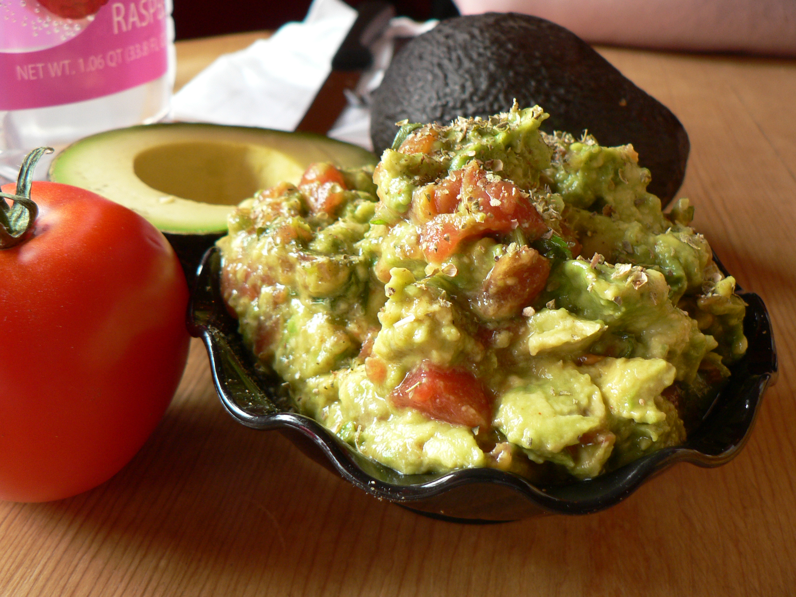
Guacamole photo by stu_spivack (CC-BY-SA-2.0), via Wikimedia Commons.
Family watching TV photo by Paul Townsend from Bristol, UK [CC-BY-SA-2.0), via Wikimedia Commons.

Tuesday, July 22, 2014

How to Make Words Do More Work

When you only have a few words to communicate a big idea, as in a tagline or a headline, you've got to make them do a lot of work.

In physics, doing work means acting on a body and creating displacement. In thermodynamics, work refers to energy transfer from one system to another. Likewise, when copy does work, it has an effect on the intended audience. Word for word, headlines have to do a lot more work than copy-heavy ads like this one.*


But how to string together a few measly words to make a really big statement? One way is to use double meaning, either with single words or phrases or with the way they're couched.

Netflix uses this device to great effect in their new campaign.

Tagline: "You gotta get it to get it."

The tagline, of course, means that you must be a subscriber to Netflix in order to understand the meaning of the image. (In this case, you really just need to be a child of the 80s, but that's beside the point.) The repetition of the phrase "get it" to capture each meaning creates a nice rhythm and sound, and the double meaning allows the tagline to do a great deal of work.

On their web site, Nike presents a succinct tagline with two meanings of "fit":

"Introducing the Nike Pro Rival Bra, the ultimate fit for the ultimate workout."
The idea of becoming physically fit is overlaid by the concept of a bra that fits well. Again, they've used the same word twice.

Double meaning in this sense is a like a pun, but it's not humorous; nor is it a double entendre, which implies that one of the meanings is, shall we say, indelicate. Whatever it's called, this device is used often in ads, and also in poetry.

Until "Evening Walk," however, I'd never seen an entire line, or series of lines, in a poem serve as a pun. Poet Charles Simic uses non-humorous puns in words and phrases to create uncertainty and double meaning which lead to a deep yin-yang tension. Here's the first stanza:

You give the appearance of listening
To my thoughts, O trees,
Bent over the road I am walking
On a late summer evening
When every one of you is a steep staircase
The night is slowly descending.

In the third line, are the trees bending over the road? Or, in a more Yoda-like construction, maybe the speaker is walking down the road, bent over. Is it late in the evening, or late in the summer--or both? At the end of this stanza, the trees are each a staircase, implying upward movement. (Will the speaker be ascending to heaven?) But this image is immediately reversed in the next line: instead, night is descending those staircases. The reader gets the sense of both upward and downward movement, and of lightness and darkness, at the same time.

Poems are written to be read, but (unfortunately for the word-lovers of this world) ads, brochures, and web sites can't be. They must be written on the assumption that they'll only be skimmed. I'd like to see (or write) a tagline or headline that can use a pun to create as beautiful and delicate a balance, and do as much work, as "Evening Walk."

Photo by Lynne Kirton [CC-BY-SA-2.0], via Wikimedia Commons

*By the numbers, each word in the Netflix ad must do approximately 135 times as much work as those in the Lien Foundation ad, although of course that's not how it works at all.

Wednesday, July 9, 2014

5 Better Taglines for Transformative Pencils


The tagline here reads: "You never know what a child could do with a pencil." Sounds kind of scary, to me. If you're a parent, you know. Your toddler could stab his sister in the eye with it, or stick it in a light socket, or eat it...the possibilities are endless.

This ad is trying to communicate "the possibilities are endless," too, but perhaps not in just that way. The copy here is clunky and easily misinterpreted; it also has no style, no rhythm, no flow, and no poetry.

What about something like...

  1. Now that's a pencil with potential.
  2. Pencils create change.
  3. Just imagine what a pencil can become.
  4. Pencils can transform people.
  5. The potential of a pencil.

Now, these ads (see the rest here) are from Spain. Are they translated? That could explain the clumsy language. In my limited experience, the answer would be no, but I'd love to hear your thoughts.

Via Ads of the World

Thursday, June 26, 2014

Never underestimate the power of the superlative negative imperative.

This cute ad by AlmapBBDO for Bauducco Toast (via Ads of the World) succeeds by pairing an attention-grabbing image with a very strong sentence.


Here's exactly what makes it work:
  • The tagline uses the prohibitive mood (no, not "Watch out, kids, I'm in a prohibitive mood tonight!"--I mean the grammatical one);
  • The tagline echoes several pop culture phrases and memes; and
  • The ad forces the reader to make a cognitive connection between the image and the copy, unifying them into a greater whole.  

"Don't Be in a Prohibitive Mood" Is In the Prohibitive Mood


It's important to understand what makes words powerful.  For example, "Stop!" is a pretty powerful word, but why? Because it's an imperative. It tells you what to do.

The imperative mood is a grammatical feature of verbs that command: verbs conjugated in this mood (such as "stop doing that," "write it now," "drink up," etc.) command an action.

The pairing of an imperative with a negative modifier (adverb or adjective) is called the prohibitive mood: "do not," for example. Using a superlative (a word describing the utmost degree of something: best, last, most, least, etc.) like "never" makes this command form extremely strong...well, actually, the strongest it can be. So "never underestimate" is superlatively prohibitive--and very strong.

Never Underestimate the Power of a Pissed Off Woman


"Never underestimate" is a bit of pop culture, too, starting popular phrases like this one


and many others, from FDR ("never underestimate a man who overestimates himself") to rampant internet memes like this one. So it's familiar and it flows off the tongue, and it helps to transmit broader cultural ideas* which in this case are also related to imperatives ("never, always," etc.), helping to underscore the message that the brand is putting across, the "we want you to do X" message, i.e., "buy our toast."

1+1=3


This ad is synergistic: it's more than the sum of its parts. The image doesn't work without the tagline; the tagline doesn't work without the image, but together, they're a thing of beauty. The image grabs you ("ha ha! made ya look!") and the tagline provides the payoff--and makes you look even closer.

Brand? What Brand?


It's a great ad, with great copy that really works well. And certainly you'll walk away from it with the concept that toast is more than just a vehicle for jam. But will you remember which brand of toast is so much better? That remains to be seen...


*Wikipedia actually has a pretty interesting discussion of memes; see especially Reference 1.

Tuesday, June 24, 2014

Waaaaa-hoo! Dialogue can include features and benefits if done well.

Blending features and benefits into a natural-sounding story is not the easiest thing in the world, but the copywriters at Doner managed without any grinding of gears in their new AutoTrader spots featuring the Dukes of Hazzard. (Read about the campaign here.) In 90 total seconds, the three spots manage to show viewers that AutoTrader's new app lets them:
  • Search by specific features, such as Bluetooth and traction control
  • Get alerts about new cars and price reduction
  • Save a search and continue later, even on another device 

The dialogue between the Duke brothers* also demonstrates the benefit of using AutoTrader: it allows them—and other customers—to find a car with more speed and options like a backup camera and doors that open. J

Despite the many features and benefits** they've worked in, the copywriting team is spot-on in tone, managing to blend 21st-century digital speak with 1980s good-ole-boy chit-chat in a way that doesn't feel incongruous or forced. Bo's line, "Pick it up on my tablet," sounds just as if he were suggesting that he and Luke pick up Route 73 out behind the old covered bridge.

I do wonder about the demographic they're hitting. Is AutoTrader's primary audience my age—that is, old enough to remember the Dukes of Hazzard? I'd *hazard* a guess that AutoTrader really should be talking more to millennials, and I'm not sure whether these spots will appeal as much to that age group.

I'm also curious about why a Dodge Viper SRT was chosen as the #New01 (nice hashtag) instead of a new Charger, to parallel the original General Lee, or Dodge's sexy new muscle car, the Challenger. The Viper SRT is an expensive car—around $125,000 new, as opposed to around $27,000 for a new Challenger. Would someone shopping for a Viper SRT even use AutoTrader? (AutoTrader couldn't find a Viper SRT for sale in my area.)

Demographics issues and personal muscle car preferences aside, these ads rock from idea to execution. Great work.


*Disclaimer: Bo and Luke Duke could sell just about anything to me. I may be biased.


**Please note: I did not call these RTBs because I don’t want to slit my wrists after publishing this post.

Thursday, May 15, 2014

Emotional Reversal FTW: Advertising Wishes It Were This Good

Nouveau happiness. Unlike nouveau riche—because, damn if it doesn’t all spend the same—it’s just not as good.

A lot of brands want to make us happy, not only with their products, but also with their advertising. P&G honestly made me happy to be a mother with their Thank You, Mom campaign by Wieden + Kennedy. Volkswagen made me not only happy to drive a Jetta but also just happy to be watching their Smiles commercial. Mattel even made me happy to have entered an incorrect URL with their awesome error 404 page.


The poem “By the Front Door,” by W.S. Merwin, is three lines long. It takes less time to read it than to sneeze. Yet, it conveys a kind of deep, ancient happiness that none of this marketing—that no marketing I’ve ever seen—can begin to touch. The poem sets the context and the reason for this happiness so perfectly that, at the end of the last line, after only 16 words, the reader herself is extremely happy.

This emotional connection is made through contrast and empathy, and our own reaction is part of the delight.

The poem starts with a feeling of inertia and sadness: "Rain through the morning." In the second line, "long" brings to mind "longing." Toads, ugly, moist creatures with a (probably unfounded) reputation for spreading warts, are not known for generating warm-fuzzies. And who ever thinks of a toad as a singer?


So by the time we're two-thirds of the way through the poem, a melancholy feeling has seeped in. But in the last line, where "singing" connects to "happiness," there's a reversal. As soon as we understand that the toad is singing because of the rain, because he's in the long pool, we understand. The reader can actually empathize with that toad, can be happy for him. The toad’s delighted to be in this environment, and in its delight it is singing an ancient happiness. Not only are we happy for the toad, but we’re surprised that we’re happy, and that the poem turned out happy. This sense of relief adds to what we ourselves feel.

In three lines, “By the Front Door” puts the reader through a small but real about-face of emotions and leaves us with a smile.

In an ad that could never be aired in the U.S. because we are a culture of whiners, Subaru attempts this same kind of reversal, hoping to leave us relieved and happy. It does work, but it’s heavy-handed. In its heart, this ad wishes it had even half the deep, elegant resonance of Merwin’s poem.

Can any ad? If you can think of one, let me know.


With thanks to The Writer's Almanac, @writersalmanac, for making "By the Front Door" today's poem and to Creative Market, @creativemarket, for The Best 404 Pages on the Internet.