Also like a lot of web specialties with fancy names, UX is not something that's limited to the web. When you call the gas company to ask about your bill and their recording tells you that you'll be on hold for approximately three minutes, and you're actually on hold for three minutes, that's good UX. But if you're told three minutes and you're on hold for a half hour, or you're not told an approximate hold time at all, that's bad UX.
Looking at something through a different lens allows us to understand that thing better. (This is why poetry is so cool: it nearly always gives us a new perspective.) That's why analogies are so awesome—even if I did get smacked for exclaiming over this one:

My husband and I went out to lunch today and experienced UX through a restaurant lens.
He ordered a Reuben sandwich. You know what a Reuben sandwich is, right? Of course you do. Everybody does. It's this:
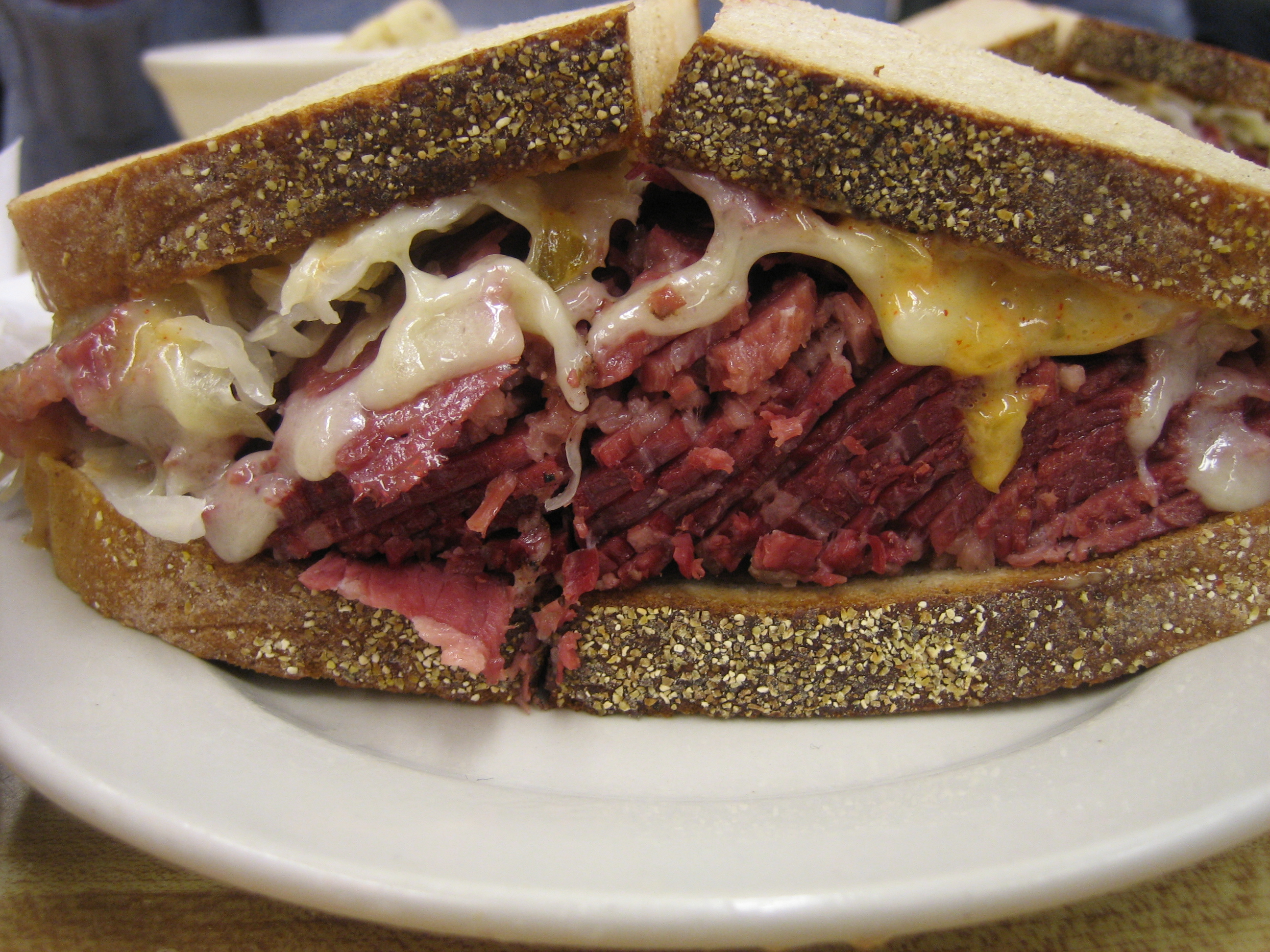
And this will tell you that, although there's a bit of variation here and there, the Reuben sandwich is pretty standardized.
Except today. My husband ordered the Reuben and he got this:

It looks like a flower, right?
Now don't get me wrong. It was probably delicious. But an open-faced Reuben with fresh cole slaw and shaved beets on top was not what my poor husband was expecting, and therefore he did not have a good experience.
That's the first truism: People want what they are expecting. If they don't get it, they're not happy. You can give me an all-expenses paid trip to Hawai'i, but if I was expecting an Alaska cruise, I'd be disappointed. No matter how good the Reuben was, it wasn't what my husband expected.** Quality of experience is based in expectation.
"Did you read the description?" I asked. "Did they say it was open-faced?"
He gave me a look. "Of course I didn't read the menu. I didn't read past the word 'Reuben,' anyway."
That's the second truism: People don't read. As content creators, as writers, this might make us sad. (It makes me sad, anyway.) It might make us worry about the future of humanity, decency, and culture. Et cetera. But it's a truth, and as content creators and writers, we must acknowledge it. TL;DR. People don't read.
On the web, user experience design relies on the same truisms. Label a button with the phrase "Show Me My Credit Score"*** and give them an opt-in page after the click—or, hell, give them an adorable kitten after the click—and they'll be disappointed, because experience is based on expectation. Put small print under the button saying something to the effect of "Registration is required to get your free credit score" and they'll still be disappointed, because people don't read.
Are you offering an open-faced "Reuben" sandwich with fresh cole slaw instead of sauerkraut and some locally-sourced, tender beets shaved on top, that will be a pleasure to the eye as well as to the palate? Great. Tell me so. Say "The XYZ Restaurant's 'Reuben'" instead of just "Reuben." Say "Our Take on the Reuben." Say something (briefly, ever so briefly) in the heading that will make me understand that what I'm getting isn't a thick, greasy, cheesy hot mess like the one pictured above.
Fulfill the expectations you set up...without making people read too much. That's good user experience, no matter what your business.
*In fairness, c) it also requires a solid understanding of the research that's been done in the field, but applying this research requires common sense.
**Now, it's a fact of life that expectation breeds disappointment, but we don't seem to be able to keep ourselves from setting up expectations. Personally, I'm trying. Not expecting makes me happier. But that's not really something we can rely on from a UX point of view.
***"Show me" rather than "Get my" courtesy of Joanna Wiebe, @copyhackers, whose great talk about buttons at Authority Intensive 2014 was just steeped in great UX.
With thanks to @NewYorker for the great analogy and to @SellingEating for the reminder.
No comments:
Post a Comment